[Python] Seaborn 기본
in DATA on Data, Python, Python_Data, Matplotlib, Basic, Seaborn, 기본
Seaborn의 기본 내용 정리한 내용임
import seaborn as sns
import matplotlib.pyplot as plt
import warnings
warnings.filterwarnings("ignore") # 경고메세지 무시
# 펭귄데이터
penguins = sns.load_dataset("penguins")
penguins.info()
penguins.head()
<class 'pandas.core.frame.DataFrame'>
RangeIndex: 344 entries, 0 to 343
Data columns (total 7 columns):
 #   Column             Non-Null Count  Dtype
---  ------             --------------  -----
 0   species            344 non-null    object
 1   island             344 non-null    object
 2   bill_length_mm     342 non-null    float64
 3   bill_depth_mm      342 non-null    float64
 4   flipper_length_mm  342 non-null    float64
 5   body_mass_g        342 non-null    float64
 6   sex                333 non-null    object
dtypes: float64(4), object(3)
memory usage: 18.9+ KB
| species | island | bill_length_mm | bill_depth_mm | flipper_length_mm | body_mass_g | sex | |
|---|---|---|---|---|---|---|---|
| 0 | Adelie | Torgersen | 39.1 | 18.7 | 181.0 | 3750.0 | Male |
| 1 | Adelie | Torgersen | 39.5 | 17.4 | 186.0 | 3800.0 | Female |
| 2 | Adelie | Torgersen | 40.3 | 18.0 | 195.0 | 3250.0 | Female |
| 3 | Adelie | Torgersen | NaN | NaN | NaN | NaN | NaN |
| 4 | Adelie | Torgersen | 36.7 | 19.3 | 193.0 | 3450.0 | Female |
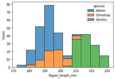
#히스토그램
sns.histplot(data=penguins, x="flipper_length_mm", hue="species", multiple="stack")
<AxesSubplot:xlabel='flipper_length_mm', ylabel='Count'>
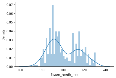
# kernel density estimation
sns.kdeplot(data=penguins, x="flipper_length_mm", hue="species", multiple="stack")
<AxesSubplot:xlabel='flipper_length_mm', ylabel='Density'>
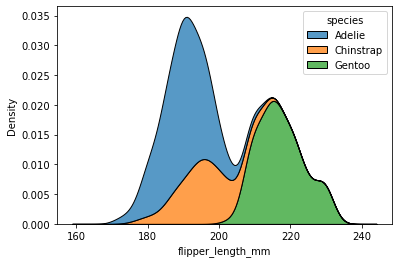
Figure Level vs Axes Level Functions
- axes-level는
matplotlib.pyplot.axes를 기준으로 만들어지고 - Figure-level은
FacetGrid를 기준으로 만들어진다.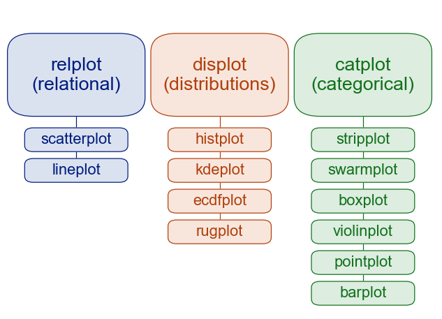
Distribution Plots
distplot
- 분포 확인
- kde차트와 히스토그램 확인가능
sns.distplot(penguins["flipper_length_mm"], bins=40)
# kde=False를 하면 kde차트는 사라짐
C:\Users\Jessie\anaconda3\lib\site-packages\seaborn\distributions.py:2619: FutureWarning: `distplot` is a deprecated function and will be removed in a future version. Please adapt your code to use either `displot` (a figure-level function with similar flexibility) or `histplot` (an axes-level function for histograms).
  warnings.warn(msg, FutureWarning)


<AxesSubplot:xlabel='flipper_length_mm', ylabel='Density'>
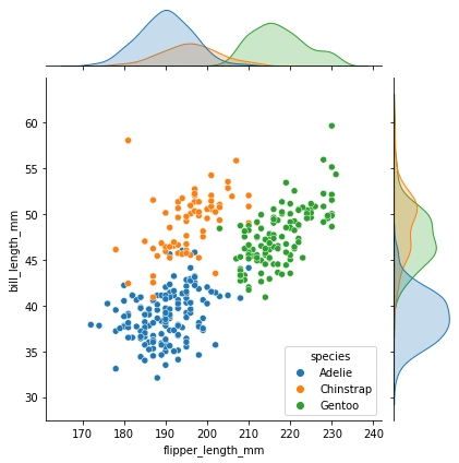
jointplot
- Scatterplot을 기본으로 각 축의 분포 확인 가능
sns.jointplot(x="flipper_length_mm",y="bill_length_mm",data=penguins, hue="species")
# hue="species" - 색반환
# kind="hex" - 육각형 모양으로 반환
# kind="reg" - Regression plot
# kind="kde"  - 등고선
<seaborn.axisgrid.JointGrid at 0x165bc527550>
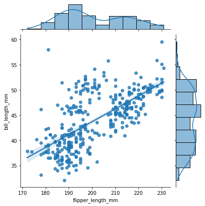
sns.jointplot(x="flipper_length_mm",y="bill_length_mm",data=penguins, kind="reg" )
<seaborn.axisgrid.JointGrid at 0x165bc4fe6d0>
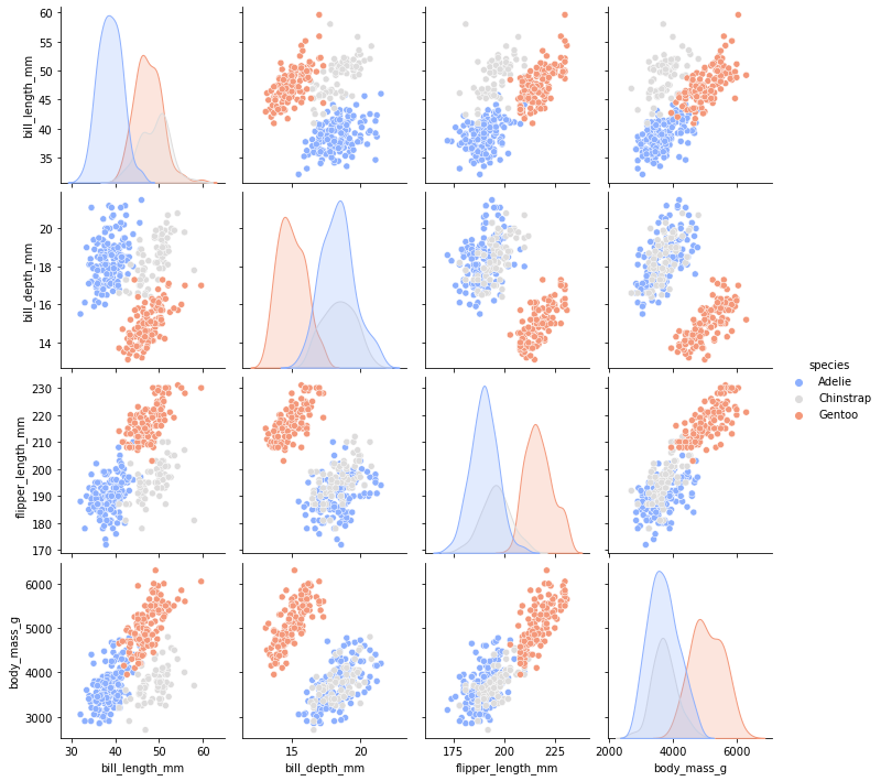
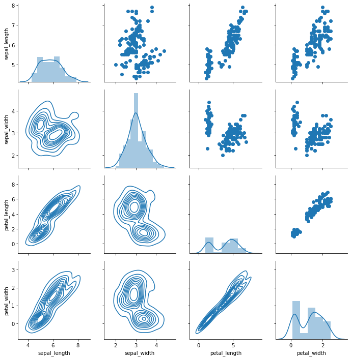
pairplot
- 모든 Numeric 변수에 대하여 Scatter plot과 분포도 그림
sns.pairplot(data=penguins, hue="species", palette="coolwarm")
<seaborn.axisgrid.PairGrid at 0x165bf0f27c0>
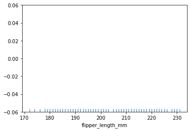
rugplot
sns.rugplot(penguins["flipper_length_mm"])
<AxesSubplot:xlabel='flipper_length_mm'>
Categoricla Plots
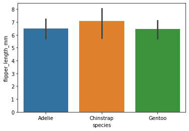
barplot
estimator인자는 Barplot의 y축을 계량하는 기준을 의미하며 default값은 mean이다.
import numpy as np
sns.barplot(data=penguins, x="species", y="flipper_length_mm", estimator=np.std) # 표준편차
<AxesSubplot:xlabel='species', ylabel='flipper_length_mm'>
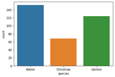
countplot
sns.countplot(data=penguins, x="species")
<AxesSubplot:xlabel='species', ylabel='count'>
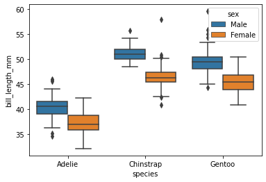
boxplot
sns.boxplot(x="species",y="bill_length_mm",data=penguins, hue="sex")
<AxesSubplot:xlabel='species', ylabel='bill_length_mm'>
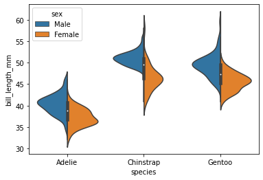
viloin plot
sns.violinplot(x="species",y="bill_length_mm",data=penguins, hue="sex", split=True)
<AxesSubplot:xlabel='species', ylabel='bill_length_mm'>
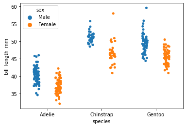
stripplot
sns.stripplot(x="species",y="bill_length_mm",data=penguins, jitter=True, hue="sex", split=True)
C:\Users\Jessie\anaconda3\lib\site-packages\seaborn\categorical.py:2805: UserWarning: The `split` parameter has been renamed to `dodge`.
  warnings.warn(msg, UserWarning)


<AxesSubplot:xlabel='species', ylabel='bill_length_mm'>
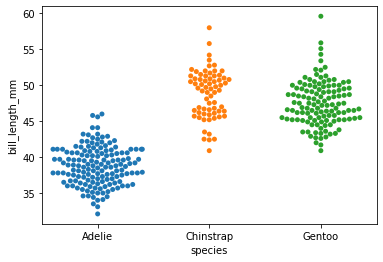
swarmplot
- stripplot과 violing plot의 조합으로 볼 수 있음
sns.swarmplot(x="species",y="bill_length_mm",data=penguins)
<AxesSubplot:xlabel='species', ylabel='bill_length_mm'>
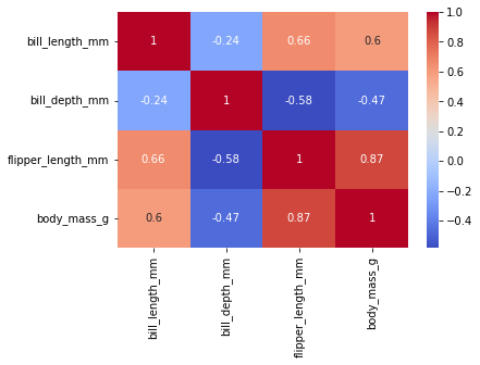
Matrix chart
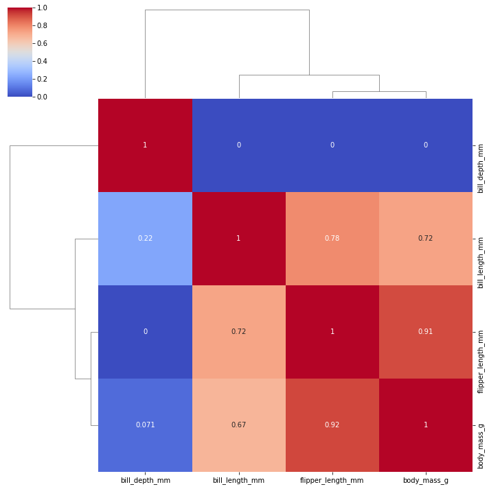
tc = penguins.corr()
Heatmap
annot=Ture인자를 통해서 히트맵에 해당하는 셀의 값을 노출할 수 있다.cmap을 통해 컬러맵 부여 가능
sns.heatmap(tc,annot=True, cmap="coolwarm")
<AxesSubplot:>
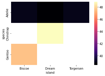
test = penguins.pivot_table(index="species", columns="island", values="bill_length_mm")
sns.heatmap(test, cmap="magma")
<AxesSubplot:xlabel='island', ylabel='species'>
Clustermap
sns.clustermap(tc, cmap="coolwarm", standard_scale=1, annot=True)
<seaborn.matrix.ClusterGrid at 0x165c2a16dc0>
Grid
iris = sns.load_dataset("iris")
iris.head()
| sepal_length | sepal_width | petal_length | petal_width | species | |
|---|---|---|---|---|---|
| 0 | 5.1 | 3.5 | 1.4 | 0.2 | setosa |
| 1 | 4.9 | 3.0 | 1.4 | 0.2 | setosa |
| 2 | 4.7 | 3.2 | 1.3 | 0.2 | setosa |
| 3 | 4.6 | 3.1 | 1.5 | 0.2 | setosa |
| 4 | 5.0 | 3.6 | 1.4 | 0.2 | setosa |
PairGrid
g = sns.PairGrid(iris)
# g.map(plt.scatter) # scatter
g.map_diag(sns.distplot) # 사선에는 distplot
g.map_upper(plt.scatter) # 사선 상단에는 scatterplot
g.map_lower(sns.kdeplot) # 사선 아래에는 kdeplot
<seaborn.axisgrid.PairGrid at 0x165c7fc8790>
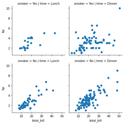
FacetGrid
- Categorical한 변수를 기준으로 그래프를 쪼개서 볼 수 있음
- Trellis(격자구조)의 개념이라고 생각하면 좋음
tips = sns.load_dataset("tips")
tips.head()
| total_bill | tip | sex | smoker | day | time | size | |
|---|---|---|---|---|---|---|---|
| 0 | 16.99 | 1.01 | Female | No | Sun | Dinner | 2 |
| 1 | 10.34 | 1.66 | Male | No | Sun | Dinner | 3 |
| 2 | 21.01 | 3.50 | Male | No | Sun | Dinner | 3 |
| 3 | 23.68 | 3.31 | Male | No | Sun | Dinner | 2 |
| 4 | 24.59 | 3.61 | Female | No | Sun | Dinner | 4 |
g = sns.FacetGrid(data=tips, col="time", row="smoker")
# g.map(sns.distplot, "total_bill")
g.map(plt.scatter, "total_bill", "tip")
<seaborn.axisgrid.FacetGrid at 0x165ca168850>
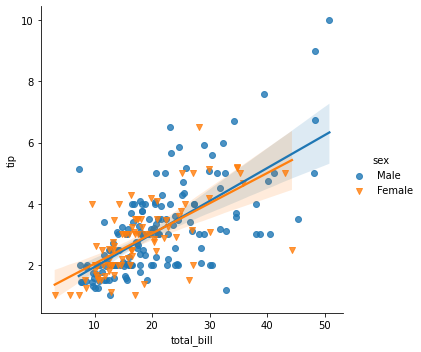
regplot
lmplot
sns.lmplot(x="total_bill", y="tip",data=tips, hue="sex", markers=['o','v'])
<seaborn.axisgrid.FacetGrid at 0x165ca196df0>
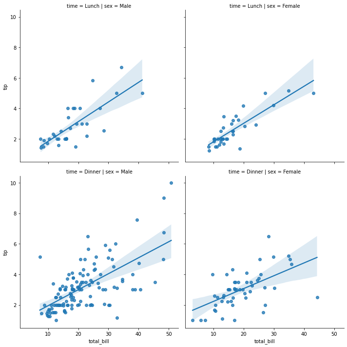
sns.lmplot(x="total_bill", y="tip",data=tips,col="sex",row="time") # auto FacetGrid
<seaborn.axisgrid.FacetGrid at 0x165ca32e400>